Here are some amusing pictures.
Tuesday, 30 June 2009
Monday, 29 June 2009
Review for 3D Max work
Below is all of the work that was produced for 3D Max, we had to be put up for an interview and have all of our work witnessed and show what we knew of 3D Max so that we could pass this unit because we were so far behind. I think it is a shame I am only going to get a pass for these units whereas in the other units I have surpassed that and gained merits and distinctions, I am going to see if there is anything I can do to bring these grades up, as I would be disappointed to have my overall mark brought downas I haved worked so hard.
Car Crash Animation.
This is a small car crash animation that I have created, I didn't create the models but only animated them, This is why I had to animate the computer that I showed below. I like this animation although it is only short I think that it looks good and if I could spend some more time on this I could possibly get a professional standard of animation. I think this animation turned out how I expected and I am happy with the final product that I have created. I think if I was going to do this again though I would learn about particles and how to use them in 3D Max so I could maybe create some rain some dust coming from the cars wheels and possibly even add some fog. I also think that some sound wouldn't go a miss if I did this again. Although I think this requires a higher level of knowledge in 3D Max than I have currently been taught. I am fairly sure that this animation will not offend anyone as I don't think there is anything to be offensive in this short animation, but if anyone is offended please contact me via this blog.
Overall I think I have animated this well the frames have been organised well and it isn't messy so you don't get confused while animating as this would become problematic.
Below is the animation.
Overall I think I have animated this well the frames have been organised well and it isn't messy so you don't get confused while animating as this would become problematic.
Below is the animation.
Thursday, 25 June 2009
Computer.
This is my computer that I modeled, I hadn't original intended it for animation use and had to create this quickly. I am not overall impressed with this animation as it was rushed in order to for me not to fail this unit. I had to give the computer some simple arms and legs and then give it some bones so I could animate it. Once I did this I animated the computer kicking the monitor, the monitor then flies off into the air. If I were to do this again I would not animate a computer, but because of the circumstances I didn't really have a choice. I like how I have modeled it and think it looks almost exactly like my computer, but do not like the animation.
And below this is the computer, Not animated.
And below this is the computer, Not animated.
Review of 3D Max work
I am now going to be reviewing all of my work that I have done for Sundesh. As we never got to make a final presentation I am just going to look at the work I have done. I will also post some videos and pictures.
Tuesday, 23 June 2009
No slideshows.
I have temporally taken down the slide shows so I can water mark the pictures, Then we will have no thieves stealing my pictures XD. I am also going to take down all of the other pictures in my post and replace them with watermarked pictures.
Storyboard Review
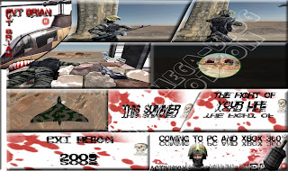
The above image is my final storyboard, I think this turned out very well, The only problem I think I had was thinking of a name for the game. I used Photoshop 3Ds Max Google maps and also Google Street view to make the scenes and I think that they all worked out very well.
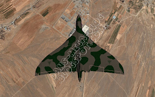
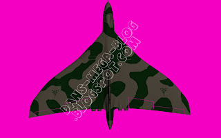
This image I made by getting some images from Google maps and using the plane model form 3D Max, I then put both of these in Photoshop and enhanced the image to my liking.
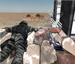
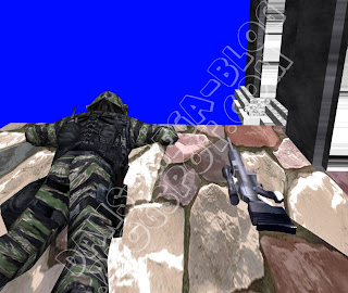
This is the image where I have used Chris Griffin, I had to add Chris to one of my images for a separate assignment that tied in well with this one. I also used Google Street view for the background image.
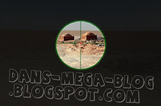
This image was also made with the help of Google Street view, I tried to make this look like a sniper scope, I think I have done quite well with this scene as I have created a good final effect.

This is the splash screen that I made, This had the age rating on and also the company that is making the game, It has my name on it (I have fuzzed it out) and it also has the PEGI Symbols.
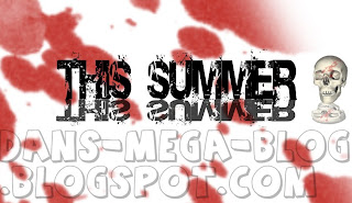
This is the scene that shows the release date of the game. I like this as the text looks mirrored and so is the skull.
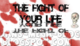
I think this is good because "The fight of your life" makes it seem more personal to the person looking at the storyboard.
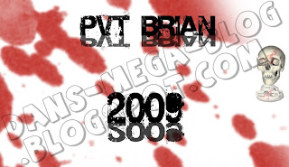
This is one of my favorite pictures, but I also had a problem thinking of the name, I used Photoshop and 3D max for this and I think the helicopter looks good and adds a nice effect to the picture.
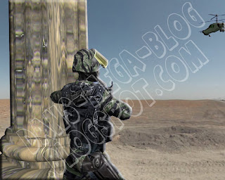
This is a picture that I also like, This has the helicopter from the picture above in it and a soldier and column from 3D max.
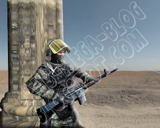
This is the picture just before the one above in the storyboard, I think this is a lot like my drawings and so is the one above, I am happy because I managed to capture the image that I had in my head. I also think that the background looks good because it suits what I had drawn.
Unit 67 Review
I think that my storyboard came out very well in the end. The drawings I had made when I planned it didn't really give me too much hope as I am not the best drawer ever but I managed to create a good final product.

The plan of my storyboard is below, This is the plan that I made for my storyboard this was also the plan for the game trailer that we never got to make because of complications. This plans shows each scene that I have made in my storyboard I think that I have re-created everything in my storyboard that I had drawn with accuracy, The final product looks a lot like I envisioned it.

The image below is a template for my storyboard, This is second template I made as I had planned to do a different design but I changed my mind because I didn't like the first one I did, I decided to do the template by hand and then scan in the final image to photoshop and use it through that. This design is not like some others that have boxes unconnected and in non conforming shapes. The image below is the first template that I made and then changed.

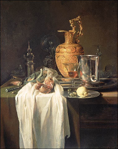
Here are some of the drawings that I have done in the still life classes, I think that some of them are good but overall are just average. I need to practice more at drawing as I am not amazing ans it shows when I am drawing. In the still life classes we did some drawings of some bowls and kitchen utensils on a table surrounded by a cloth I attempted to draw this and I think it went OK. We also used to pastels to draw some wooden models made for posing , I think that what I drew came out quite good and I am pleased with one the drawing with three models on it. We then went outside and drew a church, This was harder than it seemed and so only turned out OK, But after that we moved on and I drew a car and a house which I think was good. I would have liked some of my still life drawing to be like what I have put below but I am not that good yet. The person who has drawn this has used many different techniques that I would find hard to use but they have created a very good effect and has obviously ended up creating a really good final picture. Some techniques he would have used would probably be perspective and advanced lighting techniques. You can easily see that by the way this person has collectively used and combined many techniques shows they are advanced and they have created a great final image.
Below is a slide show of all of my drawings that I have done including concept art for my icons.

The plan of my storyboard is below, This is the plan that I made for my storyboard this was also the plan for the game trailer that we never got to make because of complications. This plans shows each scene that I have made in my storyboard I think that I have re-created everything in my storyboard that I had drawn with accuracy, The final product looks a lot like I envisioned it.

The image below is a template for my storyboard, This is second template I made as I had planned to do a different design but I changed my mind because I didn't like the first one I did, I decided to do the template by hand and then scan in the final image to photoshop and use it through that. This design is not like some others that have boxes unconnected and in non conforming shapes. The image below is the first template that I made and then changed.

Here are some of the drawings that I have done in the still life classes, I think that some of them are good but overall are just average. I need to practice more at drawing as I am not amazing ans it shows when I am drawing. In the still life classes we did some drawings of some bowls and kitchen utensils on a table surrounded by a cloth I attempted to draw this and I think it went OK. We also used to pastels to draw some wooden models made for posing , I think that what I drew came out quite good and I am pleased with one the drawing with three models on it. We then went outside and drew a church, This was harder than it seemed and so only turned out OK, But after that we moved on and I drew a car and a house which I think was good. I would have liked some of my still life drawing to be like what I have put below but I am not that good yet. The person who has drawn this has used many different techniques that I would find hard to use but they have created a very good effect and has obviously ended up creating a really good final picture. Some techniques he would have used would probably be perspective and advanced lighting techniques. You can easily see that by the way this person has collectively used and combined many techniques shows they are advanced and they have created a great final image.

Below is a slide show of all of my drawings that I have done including concept art for my icons.
Thursday, 18 June 2009
Drawings.
I am also going to put a slideshow of all of the drawings I hae done over the period I have been at college. The slide show will be above the icons one.
Unit 18 Evaluation
I think for the majority of my icons, what I have created fits quite well into the plans that I had made for the end product. This goes for all of the icons except the horror icon, this is because the original plan I had made didn't look too good so I decided to start over. I don't think that anything I have created would be offensive to anyone from any background, I haven't included any from a religion or any content that is too violent.
I have kept a similarity in each of the icons, each icon has some blood on some part of it or around the icon. I like this because it means the icons aren't all really different even though they are each for completely different genres. I am pleased that I managed to draw all of the icons but one, as I have never thought much of my drawing skills but this has let me see otherwise because what I drew I think is quite good. I also think this has helped me improve my Photoshop skills as I have used a few techniques I haven't used before, such as making the image look like it has depth by using the opacity settings.

I think that I managed my time very well as I had completed all of my icons well within the allocated time with time spare to improve on what I had created.
I think if I was going to do this again the only thing I would do differently is be a bit more imaginative with the horror design, but apart from that I would keep everything else the same.
As I am very happy with the overall result of what I have created.
Below is the sort of standard that I was looking to achieve when making the icons, I think I have achieved near to or about this quality of my icons. I am very happy with how the final products look and will keep them. This image is hyperlinked to take you to the creators page.

I have kept a similarity in each of the icons, each icon has some blood on some part of it or around the icon. I like this because it means the icons aren't all really different even though they are each for completely different genres. I am pleased that I managed to draw all of the icons but one, as I have never thought much of my drawing skills but this has let me see otherwise because what I drew I think is quite good. I also think this has helped me improve my Photoshop skills as I have used a few techniques I haven't used before, such as making the image look like it has depth by using the opacity settings.

I think that I managed my time very well as I had completed all of my icons well within the allocated time with time spare to improve on what I had created.
I think if I was going to do this again the only thing I would do differently is be a bit more imaginative with the horror design, but apart from that I would keep everything else the same.
As I am very happy with the overall result of what I have created.
Below is the sort of standard that I was looking to achieve when making the icons, I think I have achieved near to or about this quality of my icons. I am very happy with how the final products look and will keep them. This image is hyperlinked to take you to the creators page.

Tuesday, 16 June 2009
Unit 18 Review
I think that the icons I created worked very well, I am happy with the outcome and I am also pleased that I used all primary sources for creating my icons. I drew every icon by hand and the used photoshop to enhance it, and for one image I took a photo and then enhanced that image in photoshop.
 On the left is my fantasy icon. I used a sword because many fantasy games have people carrying around swords the size of a small car, compensating for anything? :)

This icon is the horror icon, this is the only icon I didn't draw, it is a photo of our car when it was snowing and my hand on the front. I am happy with this icon because it has turned out well after I had re-designed what I was doing for this icon.

This is the humour icon , this is my least favorite icon out of all I made. I think this may be because of the colours or maybe because of the slightly un imaginative design. If I did this again I would think harder about what I could do for the humour icon.

This is my Sci-Fi icon I like this because the beam in the middle looks nice and also the shape in the background looks like a crop circle.

This is probably my favorite icon that I have made. I like this because I drew the grenade and then used photoshop on it, The blood in the background also looks good behind the grenade. This icon is for the genre war.
 On the left is my fantasy icon. I used a sword because many fantasy games have people carrying around swords the size of a small car, compensating for anything? :)
This icon is the horror icon, this is the only icon I didn't draw, it is a photo of our car when it was snowing and my hand on the front. I am happy with this icon because it has turned out well after I had re-designed what I was doing for this icon.

This is the humour icon , this is my least favorite icon out of all I made. I think this may be because of the colours or maybe because of the slightly un imaginative design. If I did this again I would think harder about what I could do for the humour icon.

This is my Sci-Fi icon I like this because the beam in the middle looks nice and also the shape in the background looks like a crop circle.

This is probably my favorite icon that I have made. I like this because I drew the grenade and then used photoshop on it, The blood in the background also looks good behind the grenade. This icon is for the genre war.
Unit 18 Digital Graphics
For this unit I created some iPhone icons. The icons were for different games genre's, these were Horror, Sci-Fi, Fantasy,War and Horror. I have embedded the slideshow for my finished icons at the bottom of this page.
Thursday, 11 June 2009
Subscribe to:
Comments (Atom)

