The plan of my storyboard is below, This is the plan that I made for my storyboard this was also the plan for the game trailer that we never got to make because of complications. This plans shows each scene that I have made in my storyboard I think that I have re-created everything in my storyboard that I had drawn with accuracy, The final product looks a lot like I envisioned it.

The image below is a template for my storyboard, This is second template I made as I had planned to do a different design but I changed my mind because I didn't like the first one I did, I decided to do the template by hand and then scan in the final image to photoshop and use it through that. This design is not like some others that have boxes unconnected and in non conforming shapes. The image below is the first template that I made and then changed.

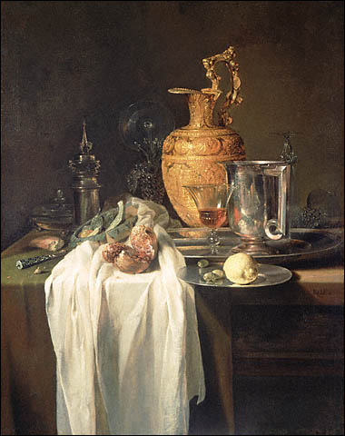
Here are some of the drawings that I have done in the still life classes, I think that some of them are good but overall are just average. I need to practice more at drawing as I am not amazing ans it shows when I am drawing. In the still life classes we did some drawings of some bowls and kitchen utensils on a table surrounded by a cloth I attempted to draw this and I think it went OK. We also used to pastels to draw some wooden models made for posing , I think that what I drew came out quite good and I am pleased with one the drawing with three models on it. We then went outside and drew a church, This was harder than it seemed and so only turned out OK, But after that we moved on and I drew a car and a house which I think was good. I would have liked some of my still life drawing to be like what I have put below but I am not that good yet. The person who has drawn this has used many different techniques that I would find hard to use but they have created a very good effect and has obviously ended up creating a really good final picture. Some techniques he would have used would probably be perspective and advanced lighting techniques. You can easily see that by the way this person has collectively used and combined many techniques shows they are advanced and they have created a great final image.

Below is a slide show of all of my drawings that I have done including concept art for my icons.

Excellent work so far, but I am afraid the evaluation itself is not quite D level. You need to be more detailed in what you say about your work compared to an 'industry example' - don't forget to include your drawing skills work - still life & perspective stuff!
ReplyDeleteI liked the style of yr Blog tho with all the copyright stuff - nice touch!