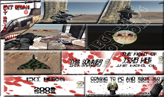
The above image is my final storyboard, I think this turned out very well, The only problem I think I had was thinking of a name for the game. I used
Photoshop 3
Ds Max Google maps and also Google Street view to make the scenes and I think that they all worked out very well.
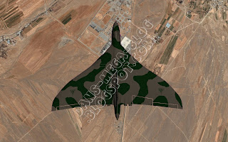
This image I made by getting some images from Google maps and using the plane model form 3D Max, I then put both of these in
Photoshop and enhanced the image to my liking.
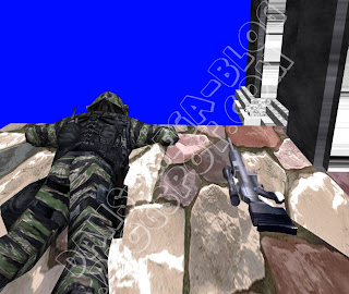
This is the image where I have used Chris Griffin, I had to add Chris to one of my images for a
separate assignment that tied in well with this one. I also used Google Street view for the background image.
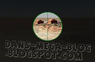
This image was also made with the
help of Google Street view, I tried to make this look like a sniper scope, I think I have done quite well with this scene as I have created a good final effect.
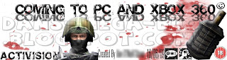
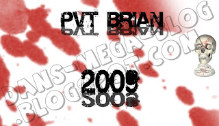
This is the splash screen that I made, This had the age rating on and also the company that is making the game, It has my name on it (I have fuzzed it out) and it also has the
PEGI Symbols.

This is the scene that shows the release date of the game. I like this as the text looks mirrored and so is the skull.
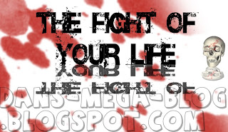
I think this is good because "The fight of your life" makes it seem more personal to the person looking at the storyboard.
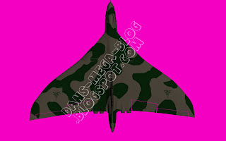
This is one of my
favorite pictures, but I also had a problem thinking of the name, I used
Photoshop and 3D max for this and I think the
helicopter looks good and adds a nice effect to the picture.
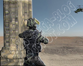
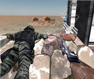
This is a picture that I also like, This has the
helicopter from the picture above in it and a soldier and
column from 3D max.
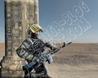
This is the picture just before the one above in the storyboard, I think this is a lot like my drawings and so is the one above, I am happy because I managed to capture the image that I had in my head. I also think that the background looks good because it suits what I had drawn.

 Once you have done this you need to open a new document with the dimensions 512x512.


