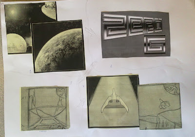
Wednesday 30 June 2010

Digital showcase overview

When I arrived at the digital showcase there were most of the students there already, there were leaflets and little sticky bug things in the room and some new people.
On the big board in one room there was various video clips of interviews from the current students, this was followed by a short video made by a media student about going to college.
In the other room were various computers with examples of digital work created by students, the final teams trailers were playing on the other bi screen and there were the paper based portfolio's on display.
The students were talking to the new people interested in joining the college, telling them what we have been doing and how we created pieces of work. The teachers were getting more involved with people interested in the course, they were interviewing them and giving them more details and answering questions which could not be answered by other members of staff or students.
During the day there was one man from Bradford University, but unfortunately the people from Team 17 didn't turn up. The overall impression I got from the new people was that they were excited to start and liked the look of what was being created and wanted to make a start on it themselves. I enjoyed meeting the new people interested in the college and talking to them, telling them about what we do and why I enjoy it.
The only problem with the day that I say was there were too many people for the rooms we were in, I think having less students at the day would have been better as the rooms were too crowded and extremely hot.
But overall the digital showcase went well.

Tuesday 29 June 2010

Trailer Reviews

42


The trailer made by 42, (my team) turned out well, when we were making our individual scenes I wondered what the overall quality of the trailer would be, but it was better then expected.
The trailer has scenes from all team members, Me doing the montage scenes, Mikey doing the ship panning scenes and Matthew doing the first planet scene. The sound for the trailer was reasonably good, not quite professional standard but it was audible, fitted the scenes well and was of good quality. I think one of the only improvements our team could have made would be to the credits, I preferred the credits created by Lee for Team Paradox as this had a nice use of lighting and really drew attention to the scene. As well as this I would have liked to have improved the special effect I used in the wire frame scene, where the scene morphs from wire frame to a textures environment.

I think compared to a similar game, such as blur's trailer ours is clearly not as professional. I am comparing it to the trailer for "Blur". This game is in the racing genre and was released quite recently. The trailer shown is of a very good professional example, being an internationally released game with many people working on the game in total. I has a great feel to it while watching as it flows smoothly, sounds great and looks very good quality. Most of the clips shown in the trailer were from gameplay, with added effects such as slowing down and panning the camera around the cars. Our compared to this looks relatively poor, but as we were a team of 4 working on it for a few months at maximum I think we did well.

The team as a whole stuck well to the planning as we all knew what we had to do and what scenes we were assigned. We all gave each other advice and helped other team members when needed. The end product that we created was made in mind for all ages to be able to view, we have not implemented any features or content which would make this trailer have to be rated any higher then "E" for everyone.

I think in the trailer it is aesthetically pleasing, the textures look good and are realistic, the 3D modeling is great and really enhances the feeling of the trailer. Our space style theme has been kept consistent throughout with the environments being set in space, the textures and sound were also sci-fi related which helped!
During our development time myself and all of the team members will look at and review each others work, this will help us improve what we have done and also having the opinions of others while you are working is extremely helpful in personal development.
See previous posts for detailed 3DMax work example.

Trailer Reviews

Lazer Baby

I think Lazer Baby's trailer was very good, the music chosen for the trailer fitted perfectly, it had an eerie feel to it as did the trailer. The modeling was good and the camera animations were done in a way that enabled you to see everything in the scenes in an ample amount of time. The trailer was in total quite long and had lots of video effects, although this didn't drawn attention away from the scenes. They had an appropriate amount of splash screens that weren't in your face and disruptive and advertised the team well.

One of the only things I would change about the trailer is taking out the extra scenes they put in, when I saw the partially completed trailer it has a few less scenes, and I think with the addition of the new ones the trailer didn't flow as well as before.

Trailer Reviews

Team Desolate

During team Desolate's trailer there is four different stories being shown, throughout. I think it is about an adventure game where the hero's have to travel across different lands throughout different environments. Each of the different environments by the team members is shown during, I think this is nice because you get to see different people's ideas and designs. One of my favorite parts of the trailer is the beginning when it starts of as a menu style, I think it is nice to implement some game style features into the trailer. One of the only complaints I would make about the trailer is the length, some of the scenes have been sped up which is fine but the trailer in total is very long, I also feel it is hard to understand what is happening the first time you watch as there is not much narration.

Trailer reviews

All of the four teams trailers are now completed and I have seen them all. I am going to be reviewing each trailer and I will make separate posts for each. Firstly Paradox.

Team Paradox

The trailer starts of with Lee's first splash screen and moves onto Andy's scene, this shows the character "The Milkman" fuzzing in and out of the screen with static, and behind him is a plane carrying a nuclear bomb. The plane then fly's over a city and drops the bomb. Some of the tall skyscrapers then collapse and the scene fades to the "Paradox" splash screen. It then moves into the scene created by Miles, this scene has a camera panning round the environment and focus's on a flag with the "Dark Shock" logo. Next is the scene created by Charlotte, this has the camera moving in on the house the Milkman lives in, a window smashes and the enraged Milkman appears shouting "Where's my wife?!" followed by the sound of someone getting their head bitten off. After this is the scene created by Tom, this shows the Milkman running through a city and talking to "Officer Jones" they have a conversation and it turns out the Milkman's wife was a cardboard cutout. One of the last scene's was created by lee, this shows a ship driven by the milkman crashing into the environment by Miles. There is a big explosion and the city is show destroyed. Credits follow.

Overall I thought the sound was very good, it all fitted well and didn't sound of bad quality. The last splash screen designed by Charlotte had a Red Dead Redemption style to it, showed all of the information about the game and suited the trailer. And the environment designed by Miles was very detailed, this looked great in the trailer and once it was destroyed with the fog and smoke it looked great!

The only bit I didn't like was the lack of textures in Tom's scene, I think it contrasted from the rest of the trailer which use good high quality textures while his were just colored.
But apart from that I think Paradox created a great trailer that is easy to follow and nice to watch.

Wednesday 16 June 2010

Creating a simple 3D Environment.

I will be showing how I created a simple 3Ds Max scene. There are some techniques used here that can be used to give your scene a perception of depth also which could be handy.

Once I had created a displacement map in Photoshop and displaced it on a plane in 3Ds Max I got to creating the texture. I used a screen shot from the UVW unwrap and marked out the high and low sections.


I then textured the low section with a rock texture, following this I put a water texture above and set its opacity to a good level which shows the rock below.


I then added some grass for a hilly texture and some snow, one I had these I set to sorting out the texture, making sure it all lined up correctly.


I then created a box surrounding the landscape, took a render from a side on view of my landscape and used Photoshop to create scenery behind the edge of the landscape.


I then created a stand for the track, this was then textured and duplicated across the track.


I then made a sky dome, and textured this.


Tuesday 15 June 2010

New revised T-Shirt design.

I have had to re-create the T-Shirt for the digital showcase, I had to make a completely different design because we weren't able to have black shirts. I am disappointed at the new outcome, although I was only given a few hours to make a new design ready to be printed.
The old design:


And the new one:


Wednesday 9 June 2010

MindMeister Mindmap

This is the mind-map I was requested to do.
You can view it here: http://www.mindmeister.com/53288164/team-42
Password is : Dan

Our Team name

We chose our team name after a number of ideas, although as a group we came to the decision to choose 42. This is a reference from "The Hitchhiker's Guide to the Galaxy" as the meaning to life, and the universe. I think the name also is nice, short and to the point. Some other names we though of were "Core" and "Nexus" although neither really had a meaning behind them.

Tuesday 8 June 2010

Zero G/ Team 42 summary

The Logo


The Logo has been explained in a previous post, we all created logo ideas and then made the images in Photoshop. Once my team had done this we had a class-wide vote on which logo would be best for the Team. And the logo shown below was chosen.

Game Logo
Because my Team logo was chosen I was the designated Game logo designer, when I was creating a logo I considered the fact that the game was going to be set in space, and would most likely be about racing. Because of this I wanted to make a feeling of speed or fast movement for the logo, I did this using the Wind filter and flipping the image.

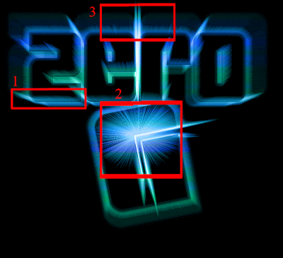
In area 1 you can see the effects of the filter has had on the edge of the letters, slightly brushing out the colours gives an apperance of movement. In area two this is where the effects of "Wind" really start to show, because the wind was generated from the right and and the image was flipped round 360° this created the shining effect in the center, I think this makes its look as if the logo or you are traveling towards a light. In area 3 you can see the light centering, almost emerging from the actual logo again giving the perception of movement.


The Game


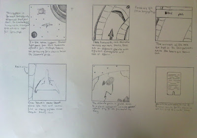
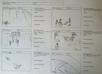
For the game we all decided to make back stories, this way we could all see what level each of us were thinking on, as-well as a story we also made a storyboard to show our ideas also, this then helped us to create a final story based on each of our ideas and drawings.
My storyboard is shown below.

And my digitized version.


We then all sat down as a group and looked at what we all had and came up with a final back story and used bits of each of our storyboards to create one which we all agreed on.
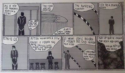
Below is Matthews hand-drawn story, and then Sean's.

Sean's

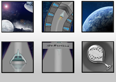
And below is the final storyboard which we are all working on creating scenes for.
Page 1

Page 2

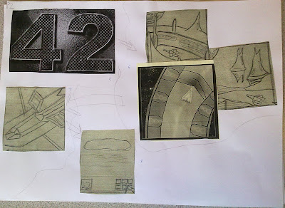
As you can probably see these are cutouts from printed versions we made, there is also the Team logo and an idea I had for the game logo before the final, these were on to symbolise the splash screens. The Storyboard follows the arrows drawn on and shows the trailer as it will be made.
First there is a shot of some planets in space, the camera zooms through space and ends up with a close up of an unknown planet. We then transfer to a splash screen, advertising the game. In the third part you are show in the cockpit of a ship, there is some dialogue which has been recorded in the script. The we transfer to our first montage of ships flying along racing etc.
On the second page the story also follows to arrows and shows, the splash screen again, this time for Team 42 and not the game. Another montage follows this, we then switch views and have a 360° pan view of a ship. And finally the credits follow.

Using this plan we designated roles to each of the members of the team, they are as follows:
Dan: Both Montage scenes.
Mikey: Cockpit view scene, 360° Pan scene.
Sean: Both splash screens and credits.
Matthew: The first scene with the planets.

We are also collectively making sound effects and are going to be assisting each other in recording lines for our scripts.

The Script

The script was written together as a team, we all decided what would be said and if someone has a scene with nothing being said they will be designated a different sound orientated job to pass Unit 71.
The script for my scene.
SCENE 3

FADE IN
INT.COCKPIT VIEW SHIP-DAY

Scene starts with a view from the cockpit of an unidentified ship, camera views the track/inside of the ship.

Driver

“Engine status seems normal, all systems online.”
(Ambient: Engine sfx , Chatter)

TRANSITION SCENE 4
Screen fades as if driver blinks, scene 4 enters as opening eyes.


SCENE 7

FADE IN
INT.SHIP CAMERA PAN-DAY

Scene starts with the camera panning round one ship, this ship is being focused on as the winning ship, camera does a 360° pan round lower angle of ship.

Commentator #2

“This new comer surely surprised the crowd today!”
(Ambient: Cheering, Radio chatter, Engines)

TRANSITION SCENE 8
Screen fades to black.


Smaller Details


Back Story
I will put the story in a separate post, otherwise this will be huge.

In any official release of a game that is going to be played by the public there are certain rules and regulations which need to be followed, this controls the access of games to minors etc.
In light of this we decided to classify the game as "E" for Everyone, this is because we intend for there to be no Drugs, Sex or violence etc.

We also intend for the games release to be on Xbox 360 and Playstation 3, as these are the main consumer consoles, and as our game will be a casual game we intended to aim it at that range of people.
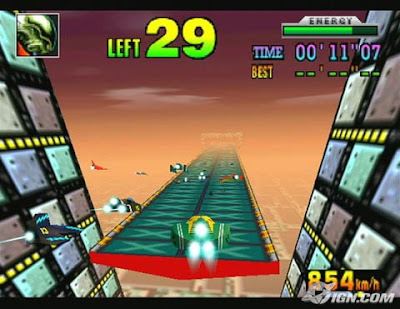
Inspirations

I have been inspired by a few different games, the first and most influential is F-Zero X, this was an old game for the Nintendo 64, this was a simple arcade style racing game, you would race against multiple challengers on a simple map area.

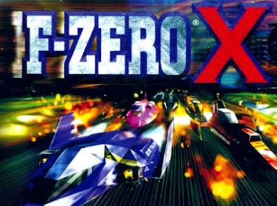
A shot from game play.


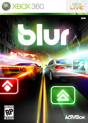
A more recent game that I have taken inspiration from is Blur, this game has been released for the Xbox 360 this is the same style racing, and is also very similar to what I would like Zero G to be like.
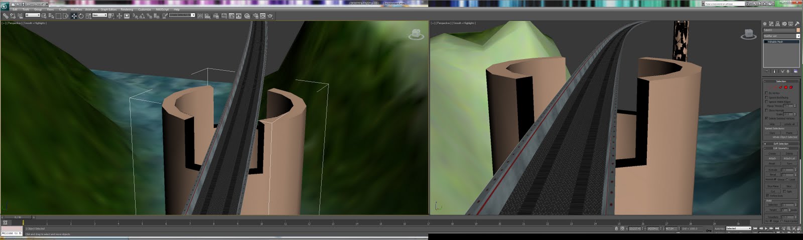


Environment
The environment style I wanted to create was a simple track, like in F-Zero X I wanted the texture to give most of the detail in the surrounding. The tracks created have a small amount of light directed where the animation will take place, this adds depth to the scene and overall helps improve the quality of what is being made.
[Example Coming]

[Add step by step production]
Final Trailer
For the final trailer, I expect it to be a video file, this will be played in full screen on Windows movie player, the final animation will probably also be in .AVI format. I am going to use .AVI for the final format because it is simple and compatible.

Tuesday 25 May 2010

Making the front cover render.

To make the render I used on the front cover (Shown below) I used 3Ds max and photoshop.
Firstly I used one of my tracks I made with a texture for the track.

The texture used for the track.

Once the track had been made I then made a tube around the track and created a texture for this.

The 3Ds Max file with the tunnel and the texture applied.

I have also applied some lights to the scene this creates a good effect and adds some level of realism to the final effect.

Zero G Game Cover 360

I have been creating the game cover for the Xbox 360 version of the game, below is the final version and a few points on how I created it.


Firstly I downloaded a template for the Xbox 360 cover, I then tweaked the cover to my needs and created some renders for the cover.

Once I had done this I created a 3D text layer for the cover in 3Ds Max, I then textured this and placed on the front cover and the spine of the cover.


Once I had done this I used the renders I had from Mikeys work and some of my work also.


I then put these into the box's I designed for the back cover and used the colors from the Xbox 360 gradient as a gradient for the box's, and I added the Team 42 logo.


The cover is now complete!


For my inspiration I looked at some less modern X360 game covers, for example I liked the "Orange Box" espically, this is because it has a clear and concise cover with nice relevant artwork. The use of colour is also applied well throughout the cover art, it has a consistent feel which is something I wanted to carryout on my cover.

Tuesday 18 May 2010

Team Meeting 18/05/10

In the latest team meeting we have had we discussed what we had all done to date, as the leader I made sure everyone felt ok with their production and were on task. We talked about what we need to do once we have covered the basic tasks and what will be collected/researched for the final tasks.

Thursday 13 May 2010

Creating my scenes.

The scenes I was designated were the two montage scenes for the trailer, it is basically going to be a montage of different ships flying through different environments. So in order to create my scenes I have had to make different environments and textures to create a different scene for each clip. At the moment I am in the process of creating more environments which I will then use the ships Mikey created to animate the final clips. I have recently had some problem with transferring files to and from 3D Max 2010 and the older version also installed on the college computers, this caused quite some bother for a while and I had to involve Chris to help me and Mikey. We have had to settle with a compromise of losing the textures from the environment instead of the ship as we didn't manage to keep both of the objects rendered.
The top image shows the first render I have done of one of my enviroments, then below what I started with, then an example of a texture and on the bottom is a selection of some of the textures I have created.